Reduced Unqualified Applications by 40% Without Reducing Lead Capture
Timeline: 2 weeks
Role: UX designer
Tools: Figma, ira,
Context
Dohzy is a fintech company focused on providing financial services for the African diaspora in Canada.
Onboarding experience needed a redesign to reduce unqualified applications, lower manual review workload, and set clearer expectations for new immigrants applying for short-term loans.
My role
I was the sole UX designer on this project and collaborated directly with the founder.
My responsibilities included:
Reviewing analytics and existing onboarding
Identifying friction and support pain points
Designing a new onboarding strategy
Improving UX writing and communication touchpoints

screensht of zoom
Problem
Dohzy was frustrated with the high volume of unqualified applications.
This created serious operational challenges:
Manual application reviews by a tiny team
Time spent sending rejection emails
Growing customer support requests
Operational cost wasted on applicants who could never qualify
Because the company is small, every unqualified application had a real cost.
The applicant felt unsupported when they needed help the most
Users of financial products have a different relationship with expectations than other industries.
Many applicants:
Didn’t fully understand eligibility requirements
Applied in urgent financial distress
Expected instant approval like payday lenders
Contacted support for clarification
The Existing Experience (Before)
Users invested effort into applying before learning they were not eligible.
Problems:
No expectation setting
No eligibility education
No pre-qualification
Users rejected at the end of the process
1-Current onboarding flow (or pdf)
2-empathy map
Goal
“I only want us to review legible applications from now on!”
Solution
xxxxxx xxxxx
xxxxxx xxxxx
xxxxxx xxxxx
xxxxxx xxxxx
We adopted a new onboarding strategy
The current approach was to get as many users as possible for the benefit of collecting data on what users needed and how they responded to the product.
Now the strategy focuses on the following:
What makes them credible
what are the criteria??
↩ Customers need an opportunity for exploration & consistent updates
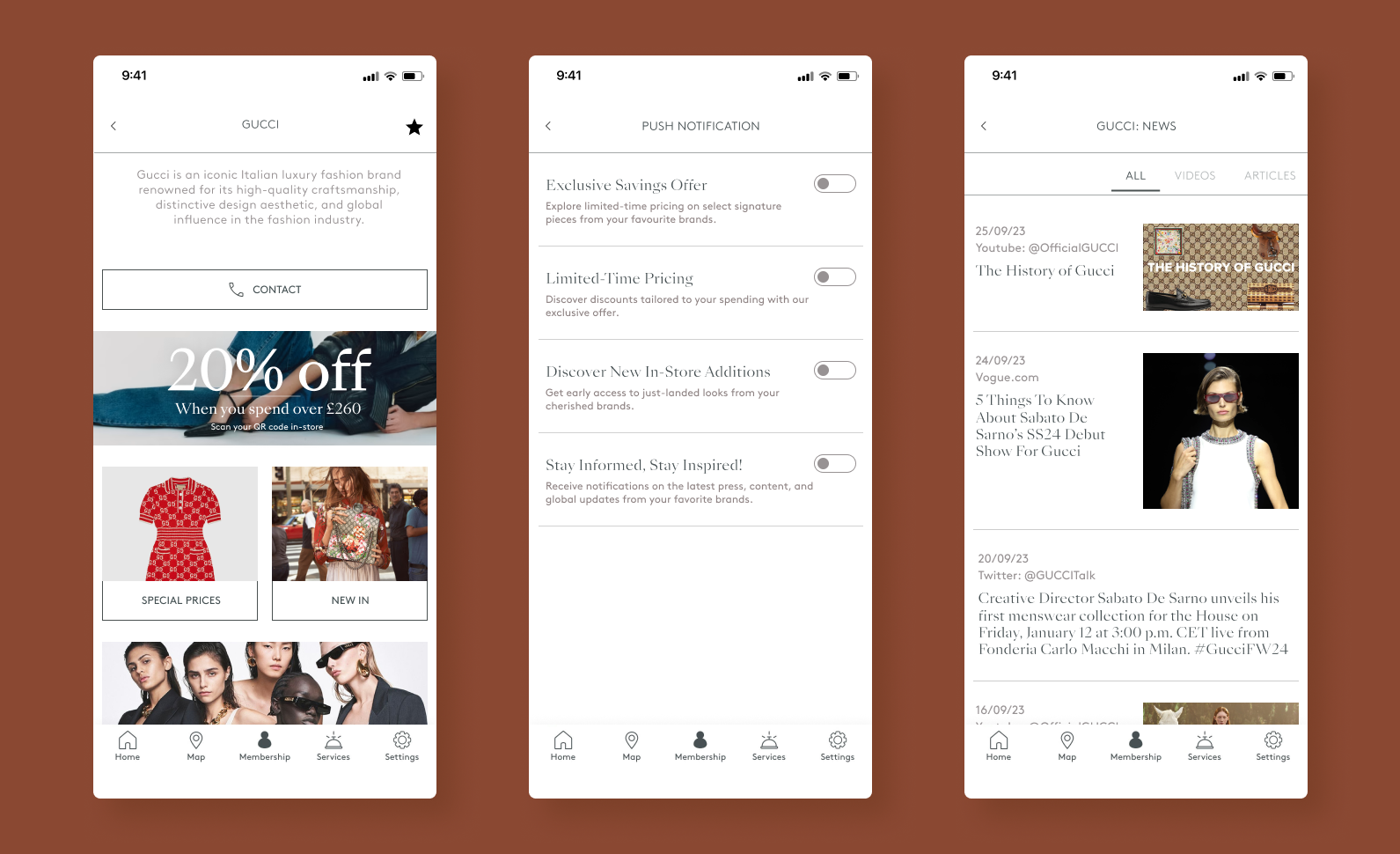
😑 Lack of new items can create a negative experience
🔔 Notifications about relevant deals and new arrivals are desired
🤝 Build trust, familiarity, and consistent positive experiences to foster a loyal relationship
User flow
Shortening the journey to your favourite brand, while extending the exploration beyond
constant communication, set expectation, explain it plainly

Current flow

New flow
Wireframes
After sketching, I created low-fidelity wireframes on Figma…

Wireframe 1st round
As I began to prepare for the high fidelity designs, I noticed some of the design elements needed to be refined.
High fidelity designs
Adopting their visual identity
Since Bicester Village already has an app, I kept the visual identity to ensure cohesion throughout.

Reflection
I’m happy with what was able to complete in a short timeframe
My initial concepts were derailed due to the information shared by the employee - I should have contacted them during the research phase of this project.
Referring to Emily’s ‘commentary’ (the user persona) throughout the process provided so much clarity!
I’ll revisit this project to give more time to smoother prototypes.
Next project